Easy Guide to Understanding the Differences Between CSS Grid and Flexbox
If you’re diving into modern web design, you’ve likely come across CSS Grid and Flexbox – two powerful layout systems that help you build responsive, structured, and visually appealing websites. While both are used to arrange elements on a webpage, they differ in structure, use cases, and flexibility. In this guide, we’ll break down their differences, explain when to use each, and provide simple examples to help you decide which is right for your project.
Understanding CSS Grid and Flexbox
CSS Grid and Flexbox are two essential tools for creating modern web layouts. Flexbox is designed for one-dimensional layouts, making it easy to align and distribute elements in a row or column. It’s perfect for simple structures like navigation menus, buttons, or card arrangements, where items need to adjust smoothly to different screen sizes.
CSS Grid, however, is built for two-dimensional layouts, giving you control over both rows and columns at the same time. It allows developers to create complex, responsive designs with precision and flexibility. By mastering both Grid and Flexbox, you can design web pages that are visually appealing, well-structured, and adaptable to any device.
CSS Grid: Two-Dimensional Layout Magic
CSS Grid is a powerful layout model that handles both rows and columns simultaneously. It’s perfect for creating full-page layouts or grid-based sections like image galleries, dashboards, and complex content arrangements.
Key Features of CSS Grid:
- Works on both rows and columns
- Provides precise control over layout structure
- Ideal for grid-based designs
- Allows placing items anywhere using grid lines
Example:
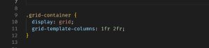
This creates a two-column layout where the second column is twice as wide as the first.
Flexbox: One-Dimensional Layout Simplicity
Flexbox, or Flexible Box Layout, is designed for arranging items in a single direction – either a row or a column. It’s often used for components like navigation bars, card layouts, or footers.
Key Features of Flexbox:
- Works in one dimension (row or column)
- Makes alignment along a single axis easy
- Ideal for content that grows or shrinks
- Provides simple alignment and space distribution
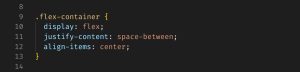
Example:
CSS Grid vs Flexbox: Main Differences
Layout Direction
- CSS Grid: Two-dimensional (rows and columns)
- Flexbox: One-dimensional (either row or column)
Content First vs Layout First
- Flexbox is content-first, ideal when you don’t know how many items you’ll have.
- CSS Grid is layout-first, better when the layout structure is defined upfront.
Complex Layouts
- CSS Grid handles complex layouts better, such as web apps or full-page templates.
- Flexbox is best suited for simple layouts, like headers, footers, or product lists.
Alignment and Spacing
Both allow for item alignment and spacing, but Flexbox offers more straightforward properties for this, while Grid provides greater control through grid lines.
When Should You Use CSS Grid or Flexbox?
Use CSS Grid When:
- You’re building an entire page layout
- You need to align items both vertically and horizontally
- The structure of your layout is known in advance
- You need to create overlapping elements or nested grids
Use Flexbox When:
- You’re aligning items in a row or column
- You’re building reusable components (e.g., cards, toolbars)
- You want dynamic resizing of elements
- Your layout is driven by the content size
Can You Use CSS Grid and Flexbox Together?
Yes! In many modern designs, developers use Grid and Flexbox together. For example, you can use CSS Grid to define the page’s main layout and Flexbox inside grid items to align text, icons, or buttons.
Example Scenario:
- A grid layout defines the header, sidebar, and main content
- Inside the main content, Flexbox aligns text and buttons side-by-side
Which Is Easier to Learn?
Flexbox is often easier to pick up for beginners due to its simplicity and fewer properties. It’s ideal for those just starting with CSS Grid and Flexbox.
However, as your design needs grow more complex, learning CSS Grid becomes incredibly valuable for full control over layout and structure.
Choosing Between CSS Grid and Flexbox
Understanding the difference between CSS Grid and Flexbox is essential for creating flexible, responsive, and visually appealing websites. While Flexbox offers simplicity and is perfect for linear layouts, CSS Grid gives you more power for creating complex, two-dimensional structures.
In many cases, the best approach is to use both in combination, depending on the needs of each section of your design.
If you’re working on a WordPress web design project, mastering Grid and Flexbox can make your themes and custom layouts more adaptable and professional. Don’t limit yourself – embrace both tools and elevate your design workflow.
🔑 Quick Recap:
- Use Flexbox for rows or columns.
- Use Grid for full-page or complex structures.
- Combine both for dynamic and responsive designs.
Need Help with Your Web Layouts?
Whether you’re just learning or building your portfolio, having a strong grasp of CSS Grid and Flexbox can set your designs apart. If you’re looking for professional WordPress web design services, feel free to reach out – let’s build something amazing together!